States are not Cooking their Books with Regard to COVID-19 / pneumonia
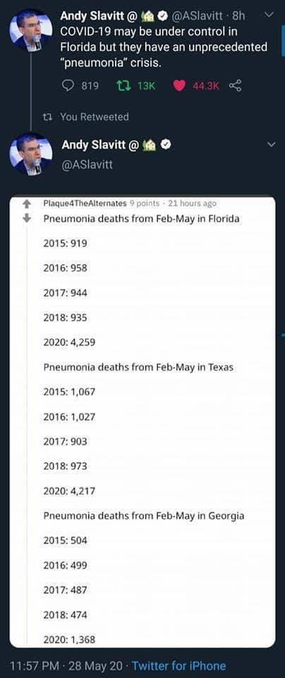
I’ve heard it said that states may be cooking their books with regard to COVID-19 vs flu & pneumonia deaths. The theory is that states want to appear “ready to open” when, in fact they are not. I looked into it and the CDC’s Fluview website shows a modest increase in flu & pneumonia deaths this year. But it doesn’t show a big, smoking gun of hidden COVID-19 deaths.
A well-meaning friend forwarded a fabricated image about the matter today. I spent an hour figuring out that it was fake.
Here is why I believe the data is fabricated. I went to the CDC’s Fluview site as mentioned by Andy Slavitt here. I downloaded the data for Florida in 2018-2020. The numbers on the CDC website regarding pneumonia deaths don’t look suspicious like it does in the above image! In Florida, in weeks 5-21 I count this many pneumonia related deaths in these years:
2020: 5291
2019: 3890
2018: 3999
That is MUCH different than the fabricated image.
There’s a lot of things I don’t know about this pandemic. But now there’s one thing I think I -do- know.

Well, we are talking about an excess of around 1,200 to 1,300 pneumonia deaths–even in a year when flu was milder (though more prevalent) than usual. (Pneumonia is often an after-effect of severe cases of the flu.) So I suspect that there is some cooking the books involved, although not of the magnitude your friend suggested. This article talks about why the numbers we have are almost certainly an undercount. https://www.nytimes.com/2020/05/13/opinion/coronavirus-us-deaths.html
Importantly, it seems that the under-counting that may be happening isn’t substantive or intentional. (I could be wrong!) My concern was, I suppose, that there was a conspiracy (oh, what a charged word that is!) to undercount COVID-19 mortalities.
Today I have been trying to download the states data and plug the undercounted people into it and see what those charts would look like. It’s a slow slog and hard to do mostly because my daughter needs to be tended to.

I -want- to
– download the data from here https://github.com/CSSEGISandData/COVID-19
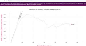
– make a graph like this
– plug in the “excess” pneumonia deaths and make another graph
I don’t have time to do it today!
But it also occurs to me that if Florida wanted to fake their data, they’d want to fake it enough so that this chart showed a DECREASE instead of keeping the same number of deaths. I mean, the guidelines are that they need to have a decrease in cases before opening up.
See how in this chart from here Florida is “white” which means they shouldn’t reopen. It’s not “green” meaning their cases are decreasing and they can open soon.
Fabrications aside, there have been some credible allegations of monkeying with the numbers. Simple bad reporting might be the problem in some cases, not active deception. Florida refuses to count cases involving non residents, for example (including a lot of seniors who live there part time).
All you really need to do is look at the data state by state to suspect that there are numerous reporting problems. Personally, I would have been willing to bet money for at least the last 6 weeks that Arkansas is underreporting–that’s probably a lack of resources not deception.
You should also be careful not to fall into the ‘Russia trap’ when it comes to death reporting: their fatality numbers are unreasonably low because doctors record people as dying “with” Covid-19, not “of” Covid-19, allowing higher level health officials to choose how to count them.
Will a health official in some part of the US classify a pneumonia death as a result of Covid while another won’t? Should we call a patient who died of complications from diabetes a victim, because there were no beds available the day she needed one (or because she was too afraid to go to the ER)? Lots of questions, lots of different answers.
We won’t know the real counts for months or even years (and some will still argue them). The best we’ll have, then or now, will be the excess death statistics.
(and I endorse that same NYTimes article for a good introduction to some of the undercount issues)
Chris, I approved your comment but haven’t gotten to look at it yet. I’ve got to sew pillows and build a fort with Abigail.
Here’s another good piece the Times put out a few weeks back. It looks like they just updated it yesterday, but a lot of the data is a few weeks behind.
http://www.nytimes.com/interactive/2020/05/05/us/coronavirus-death-toll-us.html
They note a couple of times something that a lot of people continue to overlook: reporting is not instantaneous and can lag by several weeks. “[T]here are some places that are so far behind in submitting death certificates to the C.D.C. that comparing their reported totals to historical trends would not show much.”
In this discussion, it seems that we may be in agreement that there is a lot of room for the numbers to get fudged a bit but not much room for the numbers to be fudged a lot. I see how the NYTimes article talks a lot about excess deaths and how it’s hard to get the numbers right. The numbers being off by 20% could be explained by so many legitimate factors that it doesn’t seem worth worrying about too much. But it’s definitely important to look at the trends! The basic questions are probably still answerable. Questions like “are deaths increasing or decreasing?” “is any particular strategy more or less effective at decreasing deaths”
It seems like my thesis, that the books are not being “cooked”, intentionally faked to hide something, remains intact.