A Plea for Legible Flight Reservations
A Plea for Legible Flight Reservations
Grrrr!
We’ve been at this whole commercial flight thing for about a hundred years. You would think that the airlines could create a simple, clear flight plan for me. EVERY trip I have made for the last 20 years I have had to translate their gobbly-gook flight reservation into something legible. The relevant data is always the same. Could someone in the airline industry please recognize this? Give me a calendar item that I can copy and paste into my life!
Here is what I put in my calendar. Short. Readable. Useful.
Flight Ref: XXXX
Monday November 21st
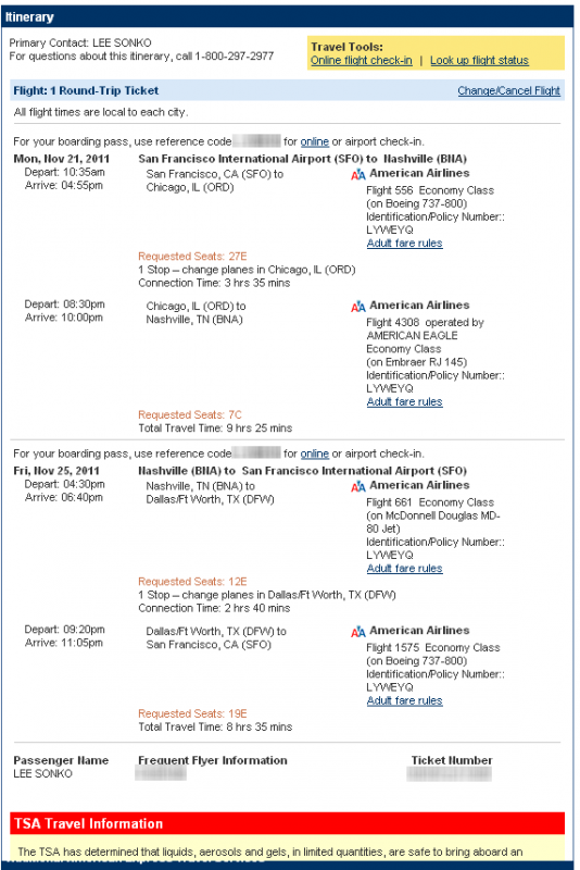
depart SFO at 10:35am on AA flight 556
arrive Chicago ORD at 4:55pm
depart Chicago ORD 8:30pm on AA flight 4308
arrive Nashville 10:00pmFriday November 25th
depart Nashville 4:30pm on AA flight 661
arrive Dallas DFW at 6:40pm
depart Dallas DFW at 9:20pm on AA flight 1575
arrive SFO at 11:05pm
and here is what American Airlines sent me. It is freaking impossible to read. Sure it contains all the relevant data but I challenge you to understand my flight info in less than 5 minutes!
It doesn’t need to be like this. Make it simple. Make it say what it needs to say. Then put the nitty gritty details at the bottom or something. Bonus points awarded if they put a “Add to Google Calendar” icon next to the reservation so I don’t even have to copy-paste. But hey…
I originally posted this in 2011 and it burns my buns every time I fly that flight reservations are still universally impossible to read. I use parts of this blog post as a template before I fly.

Followup: Continental Airlines is closer to being correct, but they still, unfortunately fail.
They sent me an email blurb that looks like so:

That’s a lot tighter than the other airline entry. But Look what happens when I copy-paste that text into my calendar:
————————————————–
————————————————–
Yowza! Cue the sad trombone sound!
Here is my rewrite:
————————————————–
————————————————–